Suppose you have a layout like this.

And on mobile you want your image to stack up but it goes down.

Let’s see how we can do that on Divi using a custom code.
From your WordPress dashboard go to Divi Theme Options and paste the below CSS code here. Don’t forget to save the changes.

/* Reverse Column on Tablet */
@media all and (min-width: 768px) and (max-width: 980px) {
.reverse {
display: flex;
flex-direction: column-reverse;
}
}
/* Reverse Column on Mobile */
@media all and ( max-width: 767px ) {
.reverse {
display: flex;
flex-direction: column-reverse; }
}
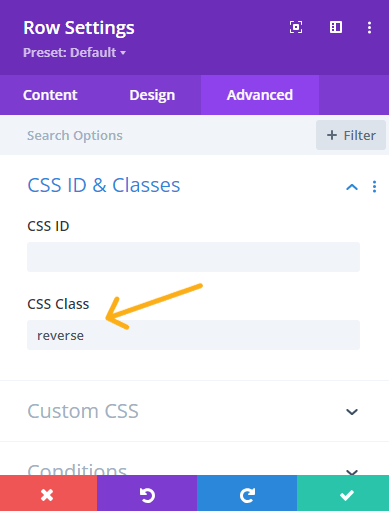
Now, go back to your page, and click on Row Settings of the column you want to reverse position on mobile or tablet devices.

Then go to Advance > CSS ID & Classes and paste ‘reverse’ class here

Hit save. And now your columns are reversed on Tablet and Mobile devices.

